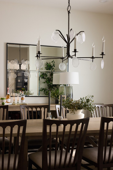
One aspect I love about Interior Design is that no two projects are ever the same. We are learning and growing with every space we work on and while that makes it challenging, it always keeps things interesting. One of our recent projects we were called on to implement color into an otherwise standard white farmhouse style spec home. Our client had purchased it rather quickly- the husband was having significant health issues and they needed to be closer to both their family and doctors. Their main focus was less the home they were moving into than the fact that they would be closer to the help that was required. About a year after they had moved and settled, sadly the husband passed.
Our sweet client took time to mourn and as she began to emerge from the haze of taking care of her ailing partner and mindfully getting back into her life, she realized it was time for a change. She didn't want to start over in a different house, so she set about modifying her house for new beginnings.

She called Simopoulos Designs and through our discovery call, I was able to understand her story and what she was looking for. She and her husband had built three custom homes together and so she was used to having a certain level of workmanship within her homes. Her current situation was different in that it had been a spec home that, while higher end- didn't have all the custom features she was accustomed to. The home was built in the white farmhouse style popularized by Johanna Gaines. While there is nothing wrong with having mostly white & gray color palette- my client was ready to infuse some cheerful color and make some upgrades.
We started by meeting and walking the house, making a list of items that bothered her. Like we do with every client, we started a shared Pinterest board and created a unique color story for her space that would drive our decisions.

The challenges:
A spec home that lacked character
Stock cabinetry with cheap pulls & knobs
Bland white and gray tiles in guest bathrooms
Tiny, ugly powder bath
Color was missing throughout the house
Light fixtures did not fit the style of home and were poorly proportioned
The family room built- in wall did not make sense with the rest of the house

The solutions:
To infuse some character and staying power, a finish carpenter was brought in to add framing to all the windows and cased out key openings- all in the same color as the walls. This added subtle dimension and depth to the walls while elevating the space.
There wasn't room in the budget for the custom cabinets the client desired, so we upgraded the look by sourcing same sized pulls, shaped to make them appear larger in scale. The previous pulls were painfully unworkable ones as they had loose ends that caught on clothing as you walked by them.
The two guest baths received a refresh by upgrading lighting, fixtures, mirrors & changing out the floor tiles.
While we couldn't expand or reconfigure the tiny powder bath, we maximized the space by designing a perfectly sized custom vanity with a small sink, new light fixture & mirror and an accent wall with fun wallpaper from Gilbraith & Paul
One of the biggest, obvious changes was the addition of punches of color throughout the entire home. Our client's favorite color is green and that became the jump off point for her color story throughout the home. The kitchen island was painted a strong green. New, colorful bedding and accessories were incorporated along with colorful, original artwork which gave the home the dose of color our client was looking for.
Every ceiling light and fan was upgraded to a properly proportioned fixture; higher quality and style- appropriate.
Along the family room wall, full length wood shelving replaced generically white, segmented shelving flanking both sides of the central fireplace which warmed up the space immediately.
All in all we (and most importantly- our client) were thrilled with the results. What do you think? Let us know below!

Lisa


Comments